Neoformat
Family-run online poster store
Branding, Visual identity, Naming

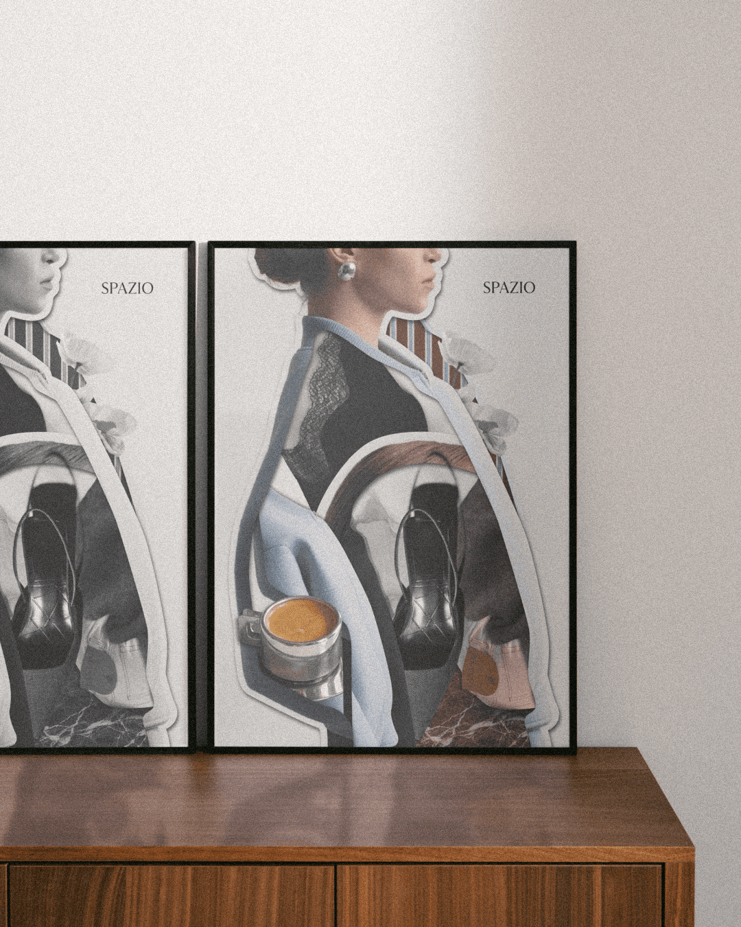
Neoformat is a family-run poster studio, built on a simple idea — to capture fragments of places and bring them into everyday life. The visual identity was designed to support this, without competing with the images themselves. The process began with structuring how the brand communicates across different touchpoints — from packaging and small details to its online presence. The aim was to create a system that feels cohesive, yet light and natural, without unnecessary form that distracts from what matters most.
The color palette is based on neutral, slightly muted tones — paper-like beiges, cool blues, and soft greys. They create a background that does not compete with the photography, but quietly complements it. The typography is simple and legible, with a subtle, technical character — referencing description, archiving, and cataloguing. Small elements appear throughout to build rhythm — labels, markers, and details inspired by documentation.
The inspiration comes from the act of collecting and preserving memories — folders, samples, recorded places. Something between an archive and a deeply personal story.
Scope of work
Branding, visual identity, naming


(Selected projects)