Forma Works
Independent creative collective
Visual identity

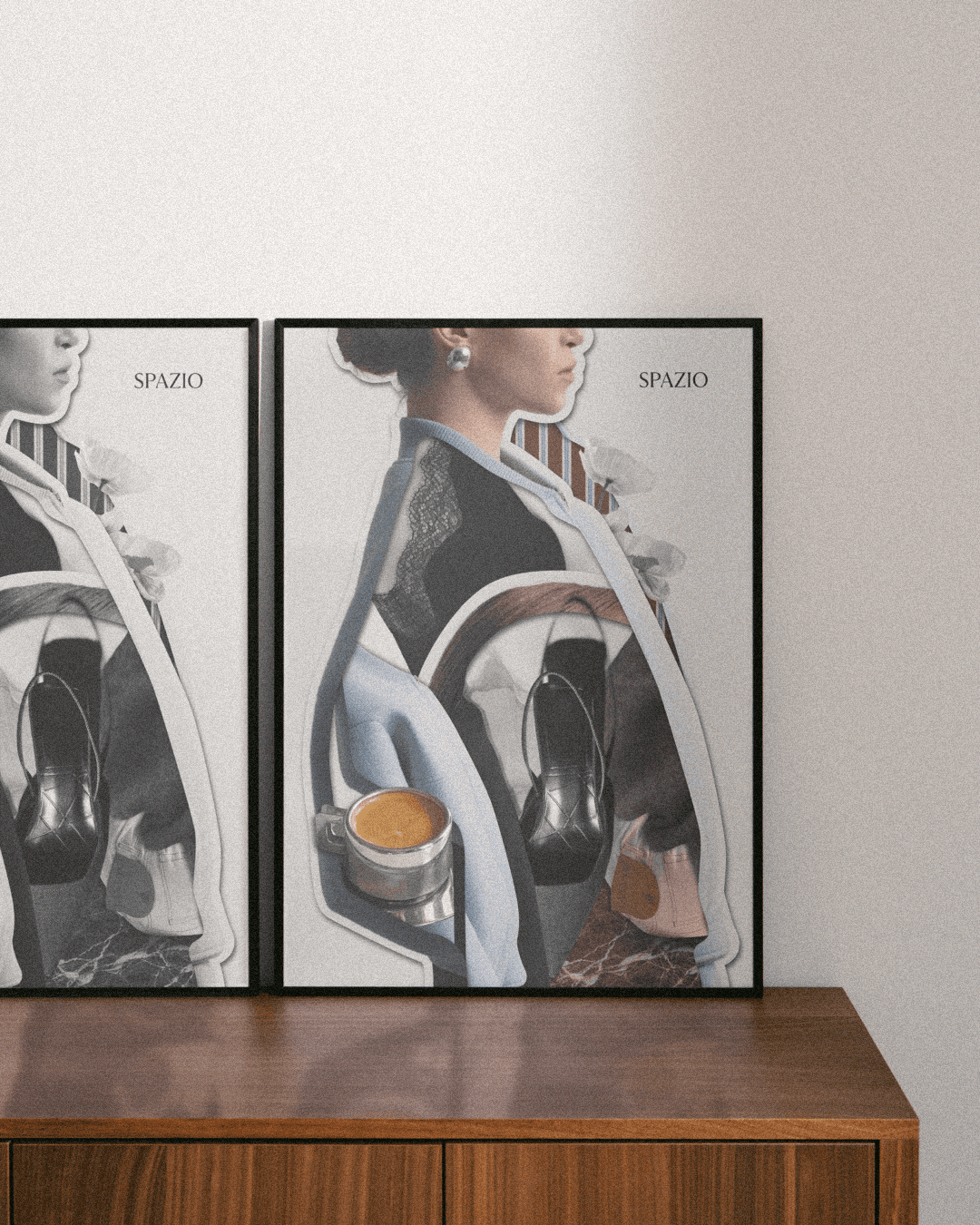
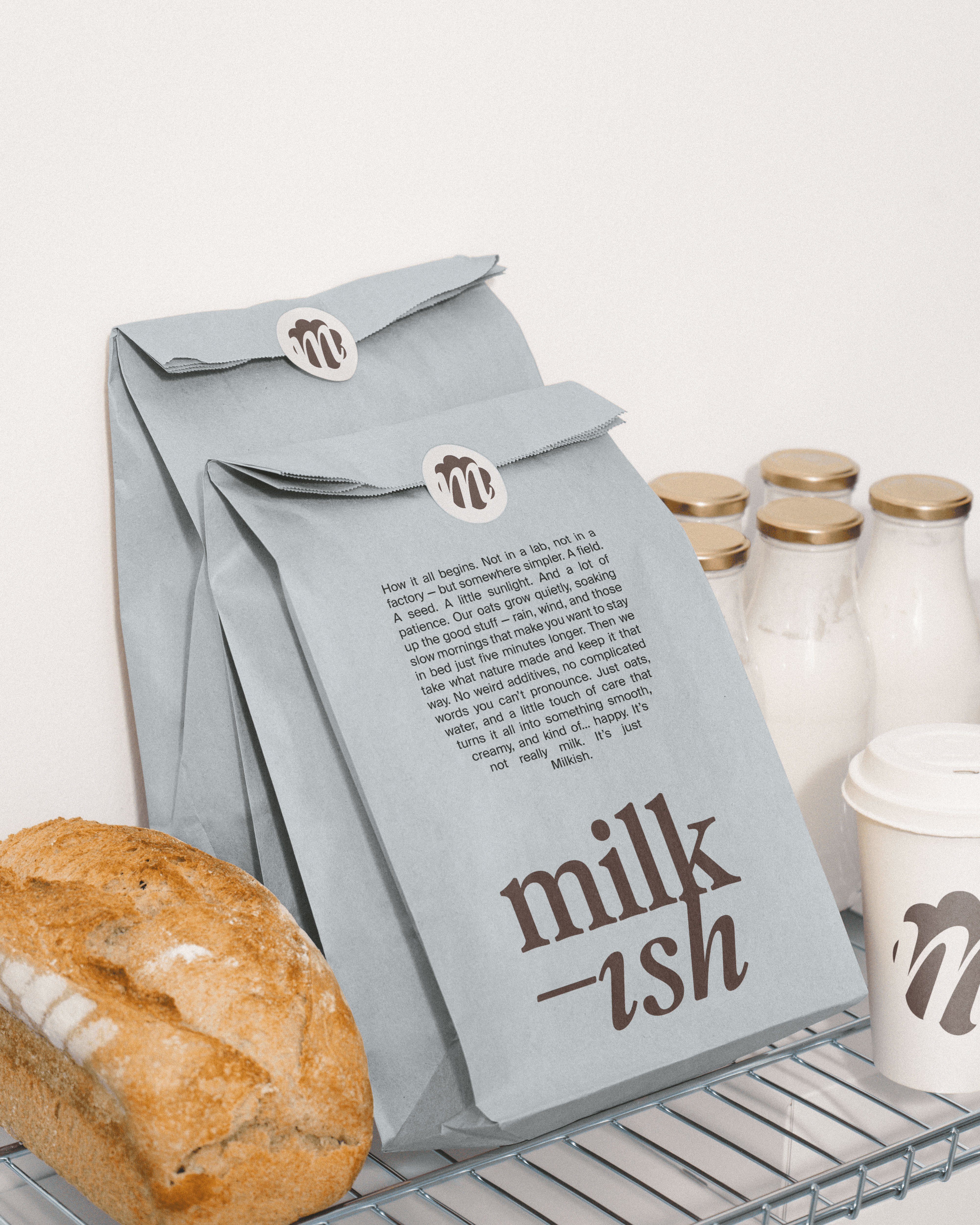
Forma Works is an independent creative collective, within which a variety of projects take shape — differing in scale, direction, and character. I developed the visual identity in close collaboration with the founder, Ewelina Kłosowska — from the first conversations, through refining the core assumptions, to building a cohesive visual language.
The starting point was the need to bring structure to this diversity. The identity was intended to act as an umbrella — something that connects different activities into one whole, without taking away their individual character. We were looking for a solution that would introduce coherence, without imposing limitations.
The color palette is based on warm, earthy tones that create a sense of calm and naturalness — serving as a background that does not dominate, but quietly organizes. It is complemented by subtle accents that introduce rhythm and lightness. The typography is simple and balanced — clear, yet with a distinct presence. It is meant to guide, rather than demand attention. It is an identity that creates structure while leaving space.
It provides a framework for diverse projects, instead of forcing them into uniformity.
Scope of work
Visual identity


(Selected projects)